Controlling heavy weight websites
I love beautiful websites. They inspire the work we do and help move the industry forward in terms of what we know is achievable on the web.
A recent trend on the web conflicts with this love; a large number of recently launched websites are putting a far greater emphasis on the beauty of the visual experience above and beyond considering the practical impact on the user.
The site that has led me to write about this is the recently launched Heart of the Arctic website. Straight up, I want to say that I'm not trying to single out this one website; it simply exaggerates the points I had been thinking about writing about.
But it looks great…
First of all, I can't deny that it's a beautiful looking website; the visual design is top notch and once the experience loads, it's clear a lot of great work has been put into creating and developing the site.
But that doesn't hide the problem that lies under the hood.
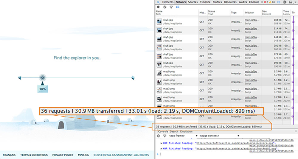
It didn't take long to notice the main issue when using the site. At work, my connection speed (when tested this morning) comes in at ~94Mbps; Pretty quick. Yet despite this, the Heart of the Arctic's loading screen took over 30 seconds to reach 20% and over a minute to start playing its first piece of video content.
Opening the Network tab in Chrome gives a better insight into what's going on:

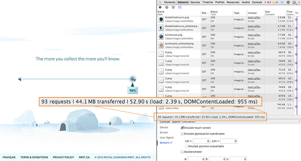
At the 20% mark on the loading screen, 30Mb of data had been transferred in just over 33 seconds. Fast forward towards the end of the loading screen:

At 98%, ~44MB of data had been transferred in almost 53 seconds. Once the loading bar hit 100%, the opening video played, and in the background another 50MB of data is transferred, taking the sites data transfer total to just under 100MB.
So all of this leads to one question.
Can excessive page weight be justified for any visual experience?
Creating immersive interactive experiences like this is difficult, especially the optimisation aspects of these projects. What I honestly can't understand is the need to load in 50Mb, or make a user wait almost a minute on a fast connection, before seeing any real content. When asking other people on Twitter to try viewing the site, a lot of people didn't even make it past the loading screen.
More thought needs to be taken about how to offset the load to when the data is actually needed. Rather than transferring all of the sites assets up front, the site should load in what is needed and defer loading the rest until later when it's actually required. This is done to good effect in the recent Middle Earth Chrome experiment, where assets are progressively loaded as you interact with and explore deeper into the site.
The Heart of the Arctic website is by no means alone. There's a whole slew of websites displaying this worrying trend. Phil Hawksworth has been doing a great job highlighting similar issues seen in parallax scrolling websites such as Oakley's recent campaign site.
Another similar example is the Sony "Be Moved" site, that weighs in at over 50MB.
All of these sites would be better served to take a step back and consider the decisions they make and the impact the perceived beauty of their site has on all aspects of the users experience.
It's not impossible to create a site that is visually beautiful while not vastly excessive. The recently voted FWA site of the year, Pharell's 24hoursofhappy.com weighs in at around 14Mb on load, progressively loading in more of its music video as the user continues to watch. Not small, but not unreasonable for such an experience.
It's also worth noting that the Oakley's site that Phil brought to attention in his post has now been optimised down to less than 15MB in size without any noticeable change in functionality – proof that with a bit more consideration, these excessive sizes can be avoided.
The impossible dream…?
It's hard to make visually interactive experiences that don't involve using huge assets. Video and high-res imagery by their nature are always going to affect the page weight of your site.
But we need to be thinking about two things.
Are we throwing unnecessary assets at a site? Beauty doesn't automatically require 100+ high-res images spinning your product around in 3D. In the majority of websites of this type, restraint needs to be displayed. Think outside of the much overused parallax trend. We have a vast array of tools at our disposal now in the browser. Consider using SVG over high-res imagery which is much more friendly when it comes to file-size.
Then, for the assets that are necessary, think about how and when you load them. Offsetting the loading of unneeded assets means users get to experience your site quicker and if they do choose to leave the site before viewing the whole experience, they haven't downloaded things they'll never even see.
So don't stop creating beautiful experiences. Just start thinking about how to control those experiences and optimise their performance to benefit the users viewing them.
Update
Since writing my post, Mikko Haapoja, one of the lead developers on the Heart of the Arctic site, has written a post detailing some of the decisions they made when creating the site. It's great to see that the team working on the project clearly thought of some of issues raised.
While I see the reasoning of many of the points mentioned, I still feel a little uneasy about any web experience that weighs 100MB up front. Some of it does come down to the goals of the project and the audience, but that is still a huge chunk of loading time to sit through for anyone, especially when you start decreasing your bandwidth. The difference between installing a game (or app) and loading a website is that the game continues to download and install when you get bored waiting for it to finish. The same isn't true on the web; someone who leaves while waiting will probably never return.
It would be interesting to see some kind of stats behind the drop-off rates between people who hit the loading screen and people who actually start the experience.
I do however agree whole-heartedly with Mikko's point that it would be a boring web without sites made purely for entertainment. I just think that if you are making a website of that size, you have a duty to think about why it's that size and do everything you can to mitigate it – which definitely includes using a strong CDN! ;)
Article posted on the 4th February 2014
